Vue3 Tailwind Form Components Part I - Reusable BaseInput Component
Building Vue BaseInput Component

This is first part of Vue3 Tailwind Form Components Series
Form Components are very important for any Web Application. Think about a project without proper Form Components with multiple forms in it. What if you need to change design of your text input or you wish to add extra functionality into text input? I did the same mistake in 2018 when using Vue2 and still my project is not easy to maintain.
Live Demo: https://scriptmint-solution.github.io/vue3-tailwind-form-components/
GitHub Repository: https://github.com/scriptmint-solution/vue3-tailwind-form-components
Do check our Advanced Featured Admin Panel at Vana Admin built with Laravel, Vue.js 3 & Tailwind CSS 3 with tons of inbuilt features to quickly build your next project.
In the first article of this series, we are going to create a Form Component:
BaseInput
Lets start with this Component:
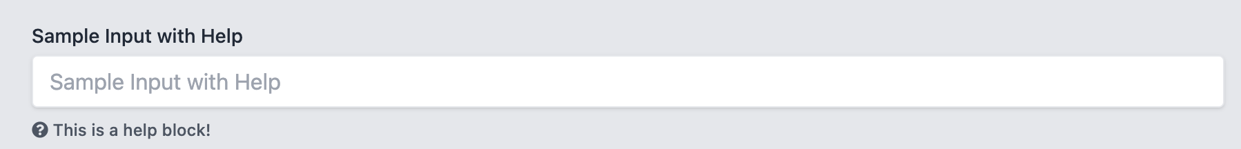
Every text input either comes with a Label. It may accompany a Help block or Error message, keeping all these mind, here is what we are trying to achieve.
<BaseInput id="name" name="name" type="text" label="Sample Input with Help" />
<HelpBlock>This is a help block!</HelpBlock>
Here is the output we are expecting:
Lets start with a very basic input component. Create a BaseInput.vue file inside your components directory.
<template>
    <div>
        <input
            class="shadow appearance-none border rounded w-full py-2 px-3 text-gray-700 leading-tight focus:outline-none focus:shadow-outline"
        />
    </div>
</template>

<script>
export default {
    name: 'BaseInput',
    inheritAttrs: false
}
</script>

<script setup>
</script>
We have only applied some css classes to make it look better. Lets add some props now. Also note that we have set inheriAttrs property to false, as we wish to bind the attributes of BaseInput to the input field (Not with the root element).
<script setup>
const props = defineProps({
    label: {
        type: String,
        default: ''
    },
    placeholder: {
        type: String,
        default: ''
    },
    modelValue: {
        type: [String, Number],
        default: ''
    }
})
</script>
In Vue3, you can pass v-model attribute in your component and it will be available as modelValue inside your component. Also, we need to bind this modelValue to the value attribute of the input field.
Next, we need to emit the value everytime whenever user input a value. To do so, we will make
<input
    v-bind="$attrs"
    class="shadow appearance-none border rounded w-full py-2 px-3 text-gray-700 leading-tight focus:outline-none focus:shadow-outline"
    :value="modelValue"
    @input="updateInput"
/>
...
...

const emit = defineEmits(['update:modelValue'])

const updateInput = ($event) => {
    emit('update:modelValue', $event.target.value)
}
Here, we bind the attributes to the input field which emits the value of the input field and make it available to the BaseInput component v-model attribute via two way binding.
That's it. You have successfully created your BaseInput component and use it anywhere in the project.
Let's assume you need to add another functionality to add labels above your input field. You don't need to go every single input field but edit it only in the BaseInput component field.
Create another BaseLabel.vue file inside your components directory and put below code:
<template>
    <label :for="for" class="block text-sm font-medium text-label text-gray-800 dark:text-gray-300 truncate">
        <slot></slot>
    </label>
</template>

<script>
export default {
    name: 'BaseLabel'
}
</script>

<script setup>
const props = defineProps({
    for: {
        type: String,
        default: ''
    }
})
</script>
Here we are accepting for attribute that will use to bind this label with the input field. Next, use it in your BaseInput component as below:
<BaseLabel :for="$attrs.id">{{label}}</BaseLabel>

...
...
<script setup>
import BaseLabel from  './BaseLabel.vue'

....
....
Simple it is. Right? Similarly, you can help block or error message component and add it in your BaseInput field.
Bonus
Add success, error, info & warning class to make your component feature reach.
Check all the source code in the GitHub repo at https://github.com/scriptmint-solution/vue3-tailwind-form-components